Visar inlägg med etikett Exhibitions. Visa alla inlägg

Carl Kostyal 1: Mike Bouchet etc


Today I tried a new gallery that seems to have made itself the new "it".
Artists that were showing their work there were Mike Bouchet, big paintings, and Yngve Holen, Katja Novitskova, Pamela Rosenkranz och Timur Si-Qin (mixed media).
And I was struck by the power of hipness, everyone there looked intensely arty, young, blackclad in 90sstyle and hungry for connections and success. I also saw a world famous pop artist there. She seemed tired and vulnerable(?). I hope she is well. Anyhow.

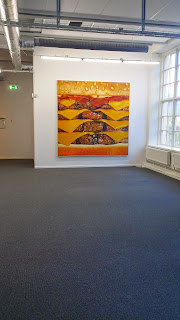
Nothing I saw of the art made me feel anything interesting or think anything new. It all felt flat and pricy. It was decoration for people who like to think they like contemporary art, and the pieces looked like you would have to pay some to get some. I dont know, it felt sort of like stuff you'd find at a fair, and not neccessarily an art fair. Perhaps the art itself was decontextualized and would be more interesting if combined and contextualized differently. Although I must say that the hamburger paintings, when seen together like this just felt slapstick hipster. Oh so that someone could have an oil painting of their favorite burger on the wall? How anti-establishment.... how in the face of established traditions and more deep-going values.

I was also struck by the perfection and expense in the sheer material and method, the slick finish the works had made me think of design and industrial design. There seemed to have been an idea and then a luxurious "print out", and the distance between the artist as maker and the work was remarkable.


 I dont know actually who has made these pieces (but one of the names above I gather). If anything I liked those above, and the lizard baby (see below). I like the form, although the hearts were a bit over the top (middle pic) and the material. But the fact that the materials are so expensive and the method so clean feels a bit, over-invested somehow. The same value in as out. Does that make sense? Seen like this, on the computer screen I like them better. Odd, dont know why.

And the lizard.

 
 Lizard: Its printed on metal (aluminium?), very neatly, reflected the light awesome, but the same as above, it feels very pricy, targeted directly toward a more wealthy strata and almost like something you would find on a industrial design fair to draw peoples attention.

Hm.
The whole thing also felt very unpolitical. Almost void on and standpoint for anything.

Stockholm
150509


Ann Eringstam Linköping

Im sort of on tour, the tour along Europe highway 4. Or not really. Im in Linköping and thought Id go and see some (local?) art. Anyhow, I saw Ann Eringstams photos (photo collages?) at Passagen. To be honest, Im not really into them - its like.. they nudge at something interesting but don't really get there completely.. or when they do, the surrounding images make me feel that the getting there was just accidental. 

That notion is sort of interesting in itself - to pinpoint it, but not now. 
Instead I want to focus on something that I thought worked. 


This is one of Eringstams photo collages. As a picture I think it is.. ok, Ive seen this enhanced realism/nature-romantic creepiness in other works. The piece however, sits in the inner of a separate little white space that can only be reached through a short but labyrinthian corridor. When entering the corridor, this piece is the "introduction": 

This is the same picture - pointing out the image elements that constitutes the collage (or at least I assume its meant to be read in that way). 1-2-3-4-5. 

In the inner room, flanking the center piece (the first pic in this post), these elements are shown isolated: 
to the left
to the right
Behind
I like this (why?); its like a riddle and its solution presented together, laconically, demystifying, moving the focus of the work (that would otherwise have been the center piece, its content) out of the center piece and into the making of it. What are we left with? What are those pieces when returned to their pre-collage state. The collage that gave them their new meaning, what are their meaning now? 
And the gun doesn't seem to actually be in the center piece. Wouldn't it have shown through the fabric of his pocket? Was that photographed made without the gun? Is that part of the point, the real twist(?). 

Rewind: An artwork constituted by a series of elements put together to create new meaning. And then those pieces are shown separately, like an "its done like this". "These elements are meaningless and interchangeable, see? It means nothing". 

Thats rather odd, right?

Linköping, 
15-04-29


Market 2015 - Cool artists


Ok the run through some of the stuff I saw at Market this year.
Olafur Eliasson
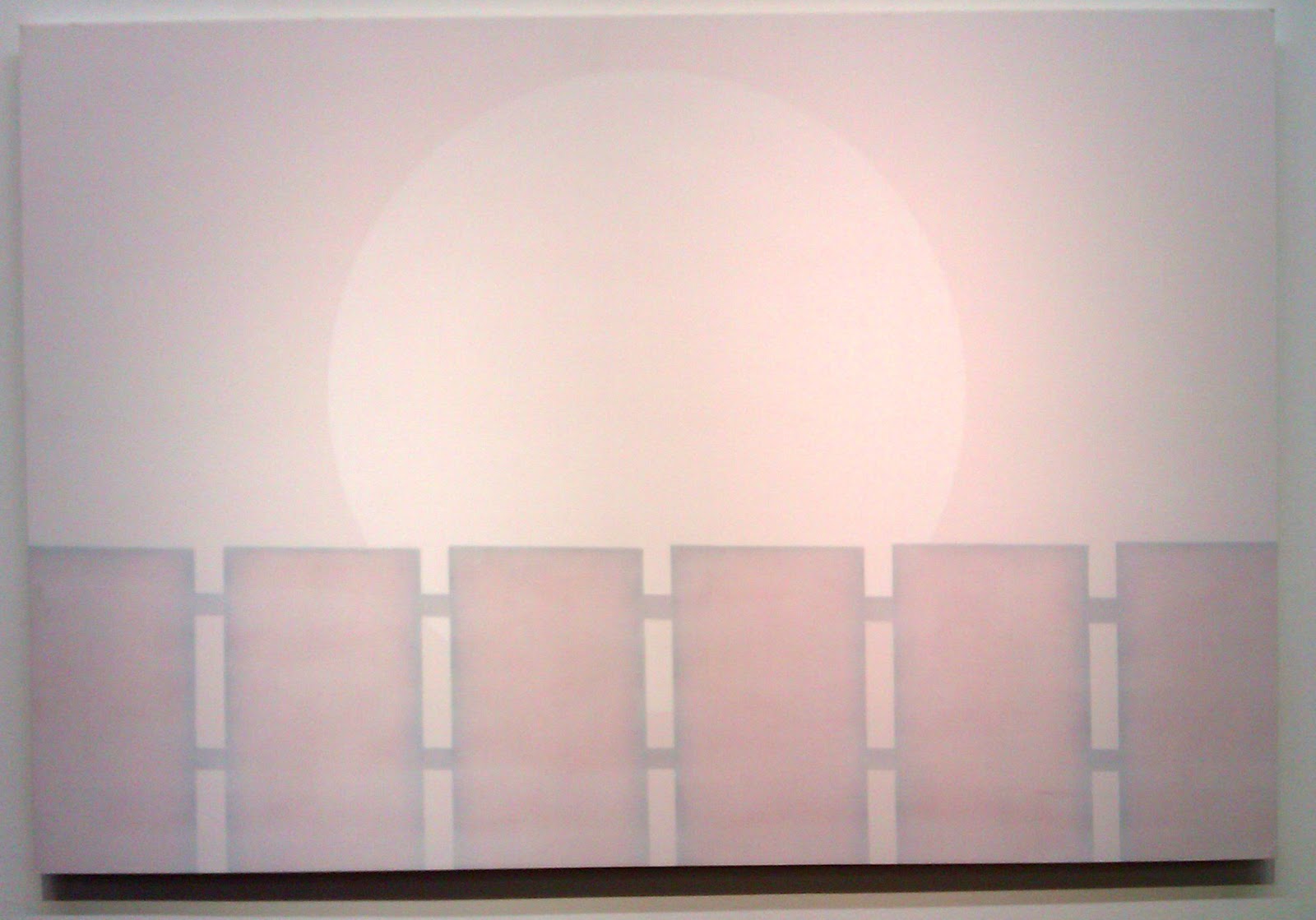
Olafur Eliasson, one of the greats right of our time(?). His works reminds me of James Turell, in how they come across so simple, sharp, light and clear. This painting above is actually more yellowish, more bright. Well. Got to be seen "live".

Andreas Albrectsen
I think I will add a specific post on this guy, since I want to start "collecting" people who work with drawing. This guy has style, the works are really pretty, although I must say that my allergy towards the subject of female nudity in art (incl pictures of sculptures of female nudes, and women with their clothes ON), is simply not getting better. I'm simply incrediby fed up. Luckily, or unluckily, the (art)world doesnt give a shit about my opinion ;) Anyhow. It will be interesting to see how this guy develops in terms of subject matter.  This is his website - I think... 

Adam Jeppesen
Photos, somewhere in Argentina (I overheard this piece of info, for some reason Im not interested). Beautiful. Intense. The paper is folded in A4(?) and then unfolded(?), leaving the creases. I like this? Why? It reminds me of the way I collect pictures; from old magazines, from posters, photos, its totally random. Sometimes I frame stuff that's seemingly been in at the bottom of a recycling bin for a while. I like that but in those cases it isn't a piece of work costing a bunch of money - ie, its not simulating being a cheap cutout from an old travelling magazine, it is a cheap cutout from an old travelling magazine. Its so dense with irony that the aesthetic brought on by lack of quality is reproduced in work that are supposedly high quality. Its so ironic that that the signs of poverty can get processed (like grains, wheat and and corn, like milk and oil and water - its bought cheaply from the poor and then processed into a new product, where the sign of poverty now is a sign of intellect and irony, of elite). Ehm. Still pretty though. 

Marco Cueva
Nice object, it works. Pulling and taunting. Sweet and evil. Lovely. I really want to stick my hand into it. Ehm. 

Denise Grünstein
For all my ranting about women in pictures, (that made me irritated even with Karin Broos, who's almost photo-realistic paintings are really beautiful and sometimes very strong - but all these women. Ueh!), this one... I dont know. I guess she seemed menacing in a slightly ethereal way. Not sexy, not available, yet not aggressive. Just contempt and transient. Like as if she was really from another century and just stopped by in space-time, looked at us with a disinterested slightly disgusted scoff and chose to not look more. Or maybe I just made that whole thing up. 

Jason Martin
I love this stuff. It gives me the shivers, like when I saw Mika Rottenbergs show in Magasin 3. These orgies in tactility sort of imposes on my physical space, make me want to taste them, engage in well, ehm, orgies? :D  All happy and curly in the brain. 

Tatjana Valsang
Maybe not so challenging, but I simply liked this work.

Eric Bidner
A rose-like clump seemingly made out of sugar and with petals of salami. Very very likeable :) Confusing in the right way. Part "eu" and part deep fascination. 

Thats all for now

Stockholm
15-04-18


Cecile B Evans at CURATRON #5

Saw recently a piece of work at CURATRON #5 (platform Stockholm) byt Cecile B Evans
http://cecilebevans.com/

The work titled Hyperlinks or it didnt happen is a piece I want to remember for its sweetness, how well its executed, the questions it answers but also because it reminds me of a work that I tried to "make come out of me" (or whatever) and I obviously wasn't the right artist for the job (or enough talented). Thankfully there are others :)


The picture is from the artists website. Al cred to her.

MARKET 2014

hello.
2014 MARKET.

My general impression was little-too-much-nice-stuff-for-walls/ same-same-as-last-year/ ok-but-wheres-the-innovations-?.
I felt that, within the frame of what Market is, it could have been more.The change of venue, the lack of "opposition" from Supermarket, didn't do very much. Was it mostly the same artists as last year? Was it the athmosphere (its simply more interesting with events where you can sense that people are truly enjoying the works and the situation; this was not the case, yet I don't want to fall into the trap of saying that everything needs to be served in the form of populistic event)?. I don't know honestly, but it just didn't feel fresh and new.

Ernst Billgren (shown by Lars  Bohman gallery) has something special for sure.
(Im sorry it looks like crap - the photo -  but I get so self-conscious when photographing stuff in Lars Bohman. They make very clear that they are just a little bit better than everyone else, its stressful...)

GRRRR AARGH! /I just lost everything I just wrote, ie I was almost finished with this post.../
Rewriting: However. I guess to some degree I did the walk around Liljevalchs with a new set of eyes. I was looking for something specific, perhaps trends, perhaps a specific trend that I can (in a new way) correlate to my own work. This I found.
I was quite fascinted by the brutality of below work. Honestly, I find it quite ugly, like, everything about it, the colours, the forms, the materials, the combinations. It reminds me of German expressionistic woodcuts, and it has this feeling of intensity of feeling and body. There's nothing dislikeable about that in itself (although I was never very into German expressionism) but the way it comes through below I simply find it, well, ugly. But then there's two. The same piece x 2. And these pieces are quite large. That whole repetition somehow defies the spontaneity, and even the directness and brutality becomes like a cold thought-out choice. Strange this is, and interesting.


Steinar Haga Kristensen
Totaler Angst der Abstraktion #2 (Der SchliePmuskel funktionert nicht mehr #63), 2014
Johan Berggren Gallery

Also here, Im generally not so into paintings and pictures of "faces" (perhaps because Im not a people-person), I often think its dull and nothing I haven't seen before. Like fire and nudity, always fascinating, you have to look, but then too often the work simply ends there. These paintings I still found rather nice, the contrast (Im a fan of Manet also, the crisp contrast and large fields of very-darks and very-lights), and the simplicity and symbolic undertones from the removed mouth or eyes. It also reminds me somewhat of Chris Berens's figures http://chrisberens.com)
Rauha Mäkilä
Left: Alek, 2013
Middle: Mura, 2013
Right: Gerli, 2013
Helsinki Contemporary

The following works by Ian McKeever and Eduardo Terrazas, are notes for myself in relation to my own work. First, Ian McKeever http://www.ianmckeever.com/ (here I had to ignore the dull 1st page of his website, it was a bit disconcerting. Yet I found some pictures there that I like a lot, very inspiring, Ive posted some screen shots below. Anyone who knows my work will know why I like his work).
Ian McKeever
Eagduru 13, 2013
Galleri Susanne Ottesen


Ian McKeever from
http://www.ianmckeever.com/


Ian McKeever from
http://www.ianmckeever.com/

And here then, Eduardo Terrazzas. I think there is a trend going on right now concerning the awareness of material and involvement of texture. I can see this in fashion - since about 2 years back theres been a whole bunch of leathers, fake-leathers, furs, fake-furs, feathers, strange synthetics often black or white. Im not a fashion designer and have no idea about whats going on in that world, but I go shopping sometimes and have noted a trend. I think perhaps this is also happening in other places of the creative landscape ie in the arts. I am mysef drawn to texture and new materials that are experienced directly or indirectly through the sense or suggestion of touch. Because of this I probably SAW such works to another extent than what I otherwise would.  - It makes me think of something I heard a while ago; something suggesting that with global connection to the internet and almost instantaneous communication that connects many scenes and events into one unfolding "presence", the time factor is becoming obsolete. WHEN something happened isnt really a factor anymore, but WHERE it happened; NY, Shanghai, Venice etc. My stray thought had to do with presence as such. The physical presence of where, here, body, texture. Anyhow. Checked  out his website but I think Im more into the black and whites below.


Eduardo Terrazas

Below is another indication towards this texture-idea I was just talking about. 


Marika Mäkelä
Planet Garden, 2014
Galerie Anhava

That is alles. 
.)

Stockholm
140416


SUPERMARKET 2014

Ok so new reflections on this years Supermarket.

This year I have asked myself ”What is the purpose of Supermarket”? Its my understanding that Supermarket began, under the name of Minimarket, as a reaction to Market (the highbrow contemporary arts fair for commercial galleries held in Stockholm every spring). Where Market was highbrow and commercial, Mini/Supermarket was meant to be underground, chaotic (though participation was still subjected to a selection process) and focused on artist-run spaces.
But the question that I ask myself in Supermarket (and not so much in Market though maybe I should), is whether Supermarket is meant to show art to the art viewers/consumers or to function as a networking forum for the activists behind these spaces. It is unclear.
On one hand there are a series of meetings and talks to with the public is not invited. This supports the networking theory. On the other hand it is a fair open to the public, with galleries showing (some sort or other of) art to this public.
A person from one of the spaces said that he thought much of the work presented was pretty bad, and that as a forum it resembles Market quite a lot, since the art isnt very underground or alternative. Should it be? Wouldn’t that lead to a possible exclusion of many spaces if they dont fit into northern European standards for good and underground. But then, isn’t that an argument where, between the lines, we assume that many spaces from other places than Northern Europe don’t have art that qualifies as good and underground?

As it is the question is quite relevant: Is the purpose of Supermarket to show qualitative underground art or present underground(?) - artist-run – spaces (as an opposition to the commercial galleries in Market)? But then, is there such a difference between the artist-run spaces of Supermarket and the commercial galleries of Market if they show more or less the same type of work (except perhaps, often, the Supermarket works tend to be a bit less qualitative)? Because if there is no real opposition, then that person with whom I was talking was right; Supermarket needs its own …well the ”BRAND OUTLET” or something. Archenemy. Or it needs to ”ömsa skinn”, transform itself. Become anew that place where an opposition (to what?) is formulated.
So perhaps that is the question with which I should concern myself: What type of opposition (and to what?) is needed no, what are the conflict, opinion- and dividing lines of the contemporary artscene?

Of course Ive seen/felt some stuff that is worth remembering:

Platform Vaasa had project that felt both relevant, acute and adequate for this setting (and that would never, in that form, get into Market).  


At the Supermarket Art Fair, Platform hosts a participatory installation/performance entitled ‘The climate change concern studio’ by Swedish artist Patrik Qvist. He started working with the project during his stay at Platform’s residency in spring 2013.

I identify as D. Where do you find yourself?
I guess personally I just find it really fascinating when someone clears the dust from the discussion to actually find out (as mentioned before) where the dividing lines are. I think this is necessary for a productive and constructive discussion about how to drive change, and if, why and what change that ought to be. 
After deciding what corner you find yourself in you could photograph yourself with a cardboard sign saying something related (I never got a full look-through of the options). This here is the background. 


The photographs were then placed on the wall (and you got your own copy of course). According the person that I talked to from this art space, the idea of the photos were placed was purely aesthetical. This is the only thing I was disappointed by in the work - its started out attempting to crystallize out some actual differences in how we position ourselves to a possibly very serious problem, but it ended with simply representing these differences as a flat mass of "individuals". That was a bit boring. It would have been way more polemic, challenging and interesting to group the photographs in accordance to the opinions expressed. (Why do get the feeling it would be more challenging? I mean, people are already being public with their opinion so its not like grouping them would really show something that isn't already there(...). Yet the opinions seem more exposed somehow if the photos are grouped, it makes it impossible to "hide in the mass". Which I think would be more interesting).

Anyhow, it was cool, and pretty. 

Other stuff. 
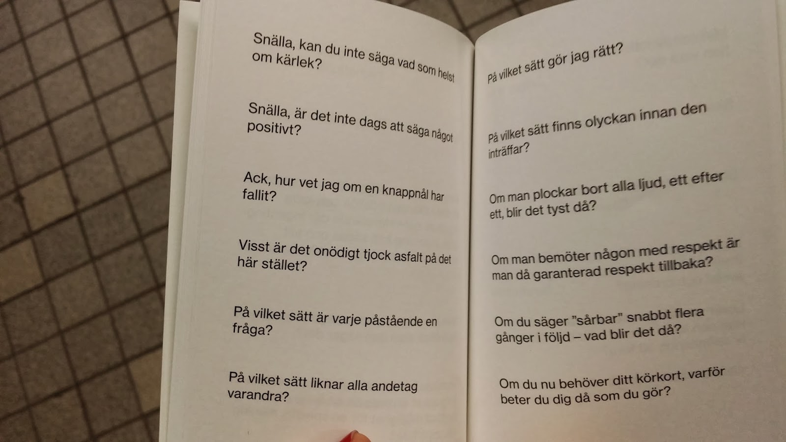
I talked for a while with a guy from OEI http://www.oei.nu/ with the innocent purpose to figure out what they do (since we sit in the same building in the Stockholm). I figured out as much as they being some sort of publishing house with focus on poetry-theory-text-art sort of. They make these really dense barely readable books that Ive always sort of liked as objects but never really figured out how to approach. Anyhow. I bought a book there. It was the smallest book that they had, and it totally made my day. It makes me truly happy and full of crazy thought and wonder. My best regards to the author Ulf Karl Olov Nilsson. The title of the book is "?" (unfortunately thereby sharing aesthetic with "Vad är konst?" (Ernst Billgren) etc book series. 

My translation: 

"Please, can't you say anything about love?"/ "Please, couldn't you tell me whatever about love?"

"Please, isn't it time to say something positive?"

"Oh, how do I know if a pin has fallen?"

"Isn't it unnecessarily thick asfalt in this spot?"

"In what way is every statement a question?"

"In what way are all breaths alike" (barely possible to translate that one, my excuses....)

"In what way am I doing right?"

"In what way does misfortune exist before it happens?"

"If you take away all sounds, one after another, will it be quiet then?"

"If you treat someone with respect, are you then guaranteed to be treated respectfully in return?"

"If you say sårbar (transl. vulnerable) quickly several times - what is it then?"

"If you need your drivers license now, then why do you behave the way you do right now?"

....and so on and so forth. Amazing. 

?

Anyhow. That'll be enough for now. 
140217
Stockholm 
  

Market/Supermarket - MINIMAL POP

Actually it was one of the artists of the IS gallery that called it "Minimal Pop" - and I think it sort of works.


 Magnus Svensson 
(Liljevalchs 2013) Im so sorry for the bad quality of the photograph, I really think this is quite an amazing picture...


Ninna Helena Olsen
(Liljevalchs 2013)


I feel like I might get lynched for so carelessly throwing in such a might name in this blogpost....
Olafur Eliasson 
(Market)


Dana Bubacova
(Supermarket 2013)


The IS gallery from the Netherlands -(Supermarket 2013)

Market/Supermarket/ - Empty spaces and institutions

Images of empty spaces/ Institutions
To all the artists who's work Im showing below - Im sorry about the bad quality of the photos (on thing HTC didnt do as good as I-ph) and I am sorry about the horrifying colourmatch with the background, Ill fix this latter problem at some point. 


Emma Fredriksson (Liljevalchs 2013)


James Copeland (Liljevalchs 2013)


  Pauliina Pietila (Market 2013)

Trine Sondergard (Market 2013)

See what I mean?
If letting myself be inspired by a show at Global Talks,   then the question becomes: What is the underlying current on a larger scale resulting in the individual artists work? What is the  background to the viewers fascination (including myself - I used to draw on this theme a couple of years ago). 
My Detroit friend complains about  ruintourism and ruin porn, the sensational exploitation of the dereliction and poverty. Is this about the same thing? 

What are the association to these spaces? 
On one hand -  a backside to the sparkly facade of the contemporary society; the loading deck, the office, spaces related to working, rather than consuming. In neither of the cases it is a question of  flexible, high-status work but rather the opposite , the body work, o r the mindnumbing environment of a office-scape. 
On another hand -  the scrutiny of the spaces in which we live our lives... finding the uncanny; that these places turn foreign and cold when we are not there to fill them, or they turn us to the perfect inhabitants of such a place - cold, foreign, distanciated...
On yet another hand (...) perhaps there is simply someting incredibly evocative about these spaces. 
 I think so - I prefer most buildings empty (offices, library, public pools)....

Hmm. Dont really feel satisfied - please come with thoughts and inspiration :-) 

Stockholm 13-03-04
With a whisky in the studio listening to reggae with a purple light over my head

MARKET / SUPERMARKET 2013

In general - 
I just feel a deep desire for contextualized work now. Two artfairs and one ultralarge and messy  gallery show (Liljevalchs Spring Salon 2013) and the forcefulness of quantity over depth (in many cases there is no lack of quality, just time- space for processing), is exhausting. I guess it has to do with the lingering fear of "missing something important", so I look and look but to be honest, I don't see much.

This is no way to experience art.

Thus - what have I seen? That I liked?
I think I will divide this in categories rather than mixing in at all up in this post (since doing so would just repeat the attitude of conceptual flatness): 

Black and white/ stuff that relates to my work (I never said the categories would be objective)
http://readings-notes-ideas.blogspot.se/2013/03/marketsupermarket-black-and-white-stuff.html

Images of empty spaces/ Institutions
http://readings-notes-ideas.blogspot.se/2013/03/marketsupermarket-empty-spaces-and.html

Chaos/ Irony/ Kitsch/ Over-the-top/ Ecstasy

 "Minimal Pop"
http://readings-notes-ideas.blogspot.se/2013/03/marketsupermarket-minimal-pop.html

See these as separate posts via the linx ;-)
(coming soon ------>)